With bold designs that capture the imagination, Jen Christiansen is excited to see where the field of scientific illustration is headed in future.
Jen Christiansen is passionate about transforming difficult-to-conceive scientific concepts into striking illustrations and diagrams. As senior graphics editor at Scientific American, her illustrations explain new discoveries in fields such as particle and quantum physics, nanoscience and reproductive health, and sometimes require a whole new visual language to bring the most complex ideas to life.
“Superposition, for example – something being in more than one state at one time – can hard to draw, because we don’t have physical things to compare them to, like the idea that an apple can be two different colours at once,” says Christiansen. “Those are challenging projects, but they’re also satisfying when you can figure out ways to do that.”
Instinct is crucial for a scientific illustrator – they must understand where concepts can be simplified without the risk of misrepresenting the science. They also need to be able to work directly with a researcher to highlight the most important aspects of their work. At Scientific American, Christiansen consults with scientists and expert authors, and does a lot of her own research into a topic, to make sure she’s illustrating it in the best way for both scientific and lay audiences.
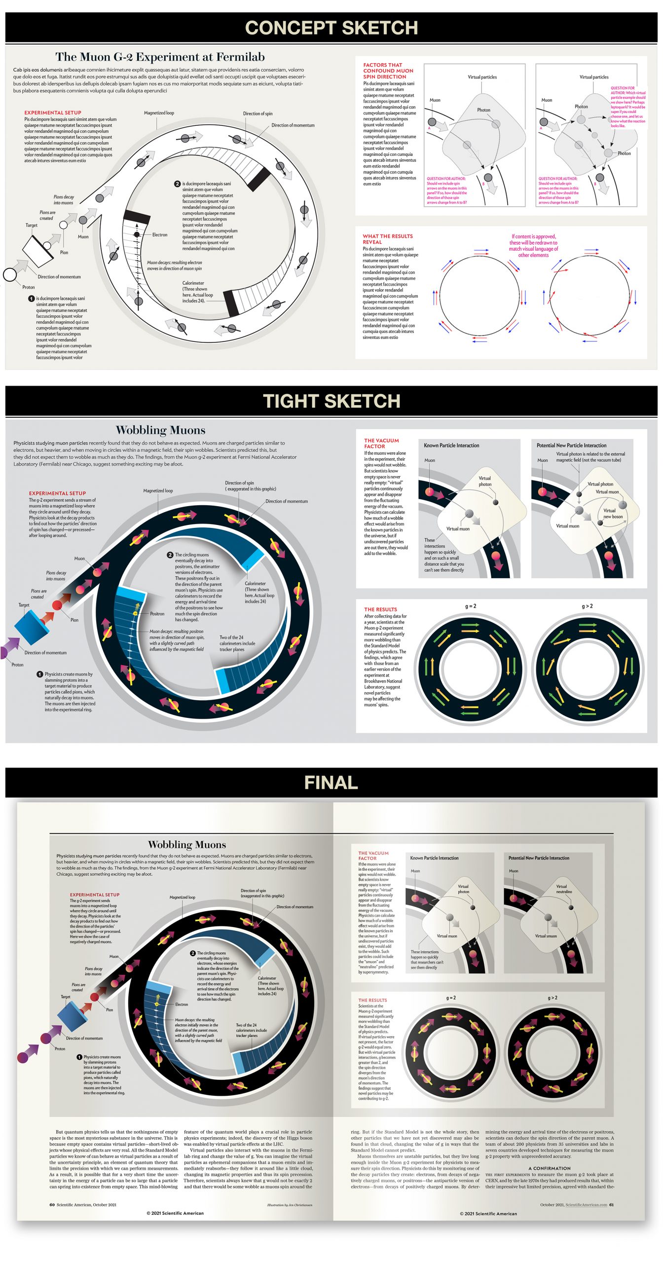
A recent example is a series of illustrations she created for an article about subatomic particles – particles that are smaller than an atom. The ‘goal of the graphic’, as Christiansen puts it, is to explain how the Muon g-2 experiment at Fermilab, a particle physics and accelerator laboratory in the United States, works. Specifically, how virtual particles – theoretical, short-lived particles that cannot be directly detected, but that interact with other particles observable ways – might be interfering with the spin of muons, subatomic particles similar to the electron.
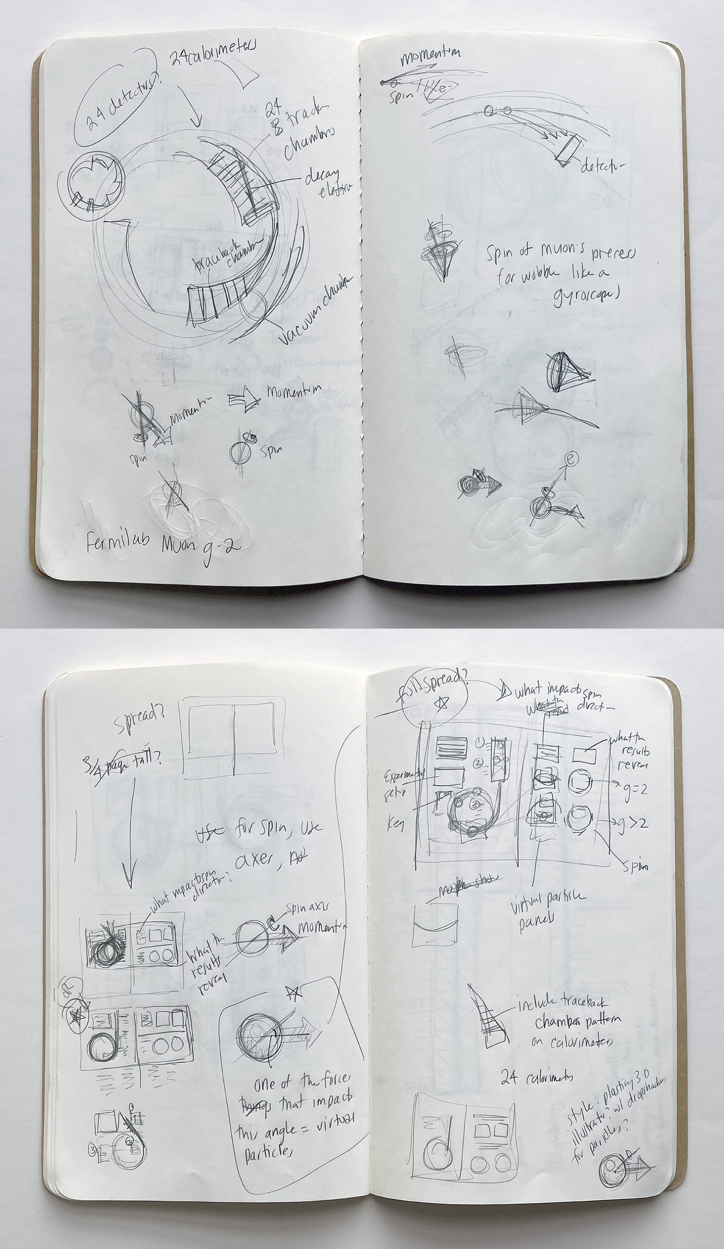
After some consulting with the rest of the article team at Scientific American, Christiansen started translating her written notes into drawings. “At first, I’m just warming into thinking about how I can organize the information in a non-linear way, and how I might be able to use imagery to tell the story,” she says. “Then I shift over into thinking about how those elements could ultimately be organized in space, on a magazine page or a computer or phone screen. The goal is to organize information so that a reader knows intuitively where to start reading, and how to move through the scene, allowing the concepts to build up to a more complete understanding of the article’s content.
The images below show how, through various stages of development, preliminary sketches are translated to the final product:


A major shift
With almost three decades of experience as a scientific illustrator, Christiansen has seen many trends in the industry come and go. While she was an intern at Scientific American in 1996, she says more than 50% percent of the artwork was delivered by post, most of which was drawings, paintings and airbrushed pieces. By 2014, most artists were sending digital artworks via email, as analog painting and drawing fell out of favour.
More recently, there’s been a growing trend for artists to digitise their ink illustrations, pencil sketches or paintings, and to finish the piece with both digital and analog tools.
The beauty of this technique is that the illustrations can be sent to editors and authors for review and tweaked far more quickly than purely hand-drawn pieces, but the end result still gives a sense of the “artist’s hand”, says Christiansen.
“There’s this aesthetic pendulum, and it started to go towards very slick, digital 3D illustrations. There was a lot going on, but it felt a little bit cold,” she says. “I think the pendulum swung back towards wanting to see the artist’s hand and wanting to kind of have a more tactile feeling to the artwork. I think it’s in response to what audiences are craving over time.”
Forging a path
Born in southern California, Christiansen moved to Massachusetts as an undergraduate, where she double-majored in geology and studio art at Smith College in Northampton. The combination that made her realise that she loved science just as much as painting and photography, and relished the opportunity that her geology professor, Al Curran, gave her as one of his his teacher’s assistants, creating exhibits, displays and maps for his papers.
“Just seeing other people who were balancing art and science and figuring out different ways of incorporating both in their studies helped me to realize that, first, I wasn’t weird, and that there are other people who saw the value in this,” says Christiansen.
In 1995, she attended graduate school at the University of California, Santa Cruz, completing a natural science illustration certificate in the science communication programme. This led to an internship at Scientific American with art director Ed Bell. After two years, Christiansen moved to National Geographic before establishing her own freelance design business. She returned to Scientific American in 2007.
As a way of honouring the time Bell and others spent training and mentoring her, Christiansen says she wants to re-invest that energy into the next generation of artists. She mentors interns in graphic design at Scientific American, speaks at events and engages with readers via her website and on social media.
“I feel like there’s this chasm right now, where evidence-based thinking is feeling a little bit perilous,” says Christiansen. “I’m trying to get people to think in terms of what evidence is and how it can help to influence decisions.”
In 2022, Christiansen published Building Science Graphics: An illustrated guide to communicating science through diagrams and visualizations (A K Peters/CRC Press), which she describes as her proudest achievement. The book breaks down the principles of design and science communication and provides ‘do-it-yourself’ tools to demystify the process of designing science graphics.
In many ways, says Christiansen, science can learn a lot from illustration. “The way it pushes you to fill in gaps that you didn’t know were there. Once you start drawing something, you can’t hide behind the fact that you don’t know what part of it looks like.”
Story by Gabrielle Ahern


Comments are closed.