
For the past 13 years, Johan Jarnestad has had the dream job for anyone who’s interested in science and art: he creates cartoons that illustrate the science behind the work of Nobel Prize winners.
He sits in the room as the Nobel committee members consider whose work is laureate-worthy, sketching away as they pontificate. His aim is to produce a visual vignette of the science to help the public understand it and why it’s important. It’s quite the tall order, and he has a hard deadline: his designs are published alongside the announcement of the prizes.
The concepts that Jarnestad is asked to illustrate are far from simple. In 2020, for example, he was tasked with explaining what a black hole is for that year’s Nobel Prize in Physics. He opted to slice a black hole in two, showing two different cross-sections of the phenomenon, one lengthwise and the other width-wise.
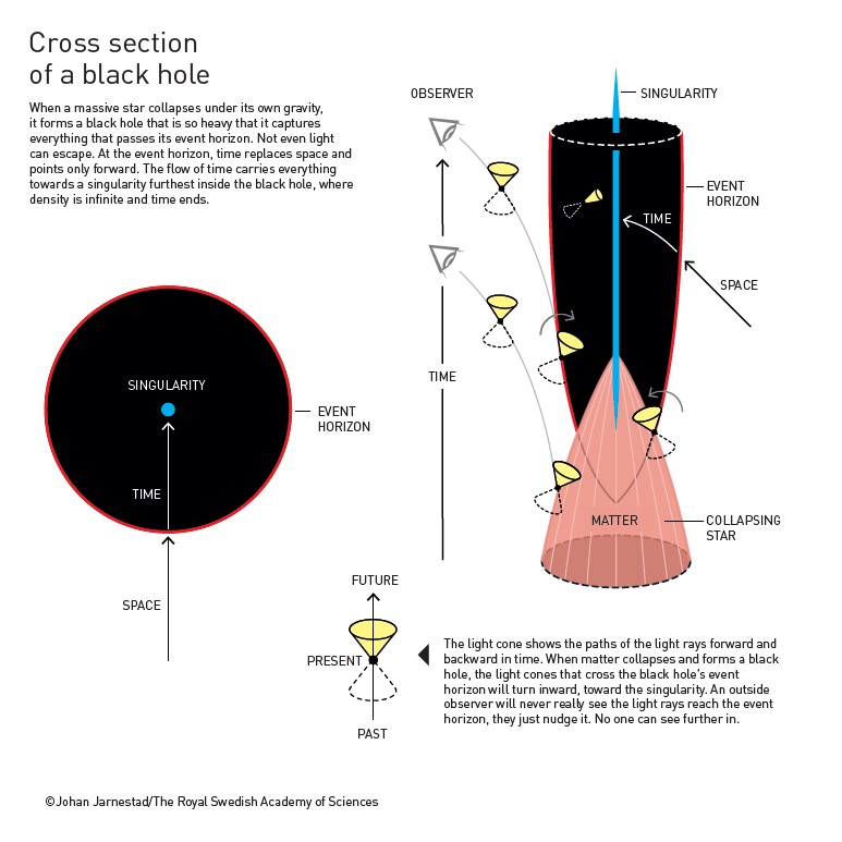
Understanding what a black hole might “look like” was a tough brief, says Jarnestad, but that’s par for the course – coming up with visual representations for scientific concepts is rarely simple.
You need to go on vacation after doing it. It’s exhausting, but I’ll likely keep doing this until they throw me out.”
Trial and error
As the Nobel Prize committee discusses the contenders, Jarnestad starts by simply Googling the research before he puts pencil to paper. Then he draws whatever comes to mind. “If I’m lucky, it’ll be an area of research that I’ve touched on before. But often it’s something I don’t know much about,” he says. “Fortunately, I have the luxury that there are experts in the room with me – the committee members are scientists, and I can run things by them.”
Then it’s a process of trial and error; Jarnestad takes the committee members’ feedback into account and redraws. He usually goes through a few drafts before he arrives at something satisfactory. “I see my role as sending ideas from the rough stage and then changing and communicating with the scientists. You could really call it a group effort,” says Jarnestad.
The final layer of feedback comes after the work is published. Jarnestad waits for the public’s reaction, ever fearful that someone will point out errors that have unwittingly made their way into the final draft. That’s always a nerve-wracking moment, he says, but he hasn’t made any glaring errors yet. “I’ve gotten a lot of really good feedback on Twitter and from my nerdy community,” he says. “That’s how you know it’s a successful illustration.”
Mid-century origin story
Jarnestad has been a professional illustrator since the 1990s, working as a visual journalist for magazines and newspapers in Sweden. But he says his career actually began when he was about 10 years old. “There was a competition where everyone had to come up with a T-shirt design for the school and I made one with an owl with a pen in its mouth. I won, and it kind of became a logo for the school,” he says. “I felt like a hero.” He was hooked ever since.
Design, if not specifically illustration, is also in his genes. “We had a mid-century [design] boom in Scandinavia and my father was at the centre of that as a porcelain and ceramics designer. I would watch him in him in his arts studio,” Jarnestad recalls. “I have a lot to thank him for, in that sense.”
Science much came later to him, when he was working for newspapers in his 20s and was partnered up with a science journalist. He loved the subject matter, but grew frustrated that he’d often only be given a couple of hours to come up with a concept – a natural consequence of working in the daily press. So, Jarnestad opted to go freelance.
In 2011, Jarnestad was approached by the Royal Swedish Academy of Sciences, the Stockholm-based organisation that is responsible for selecting the Nobel Prize laureates, and asked to work on the prizes. He thinks they were attracted to him thanks to his efforts to keep his designs simple. “I don’t like to bang my own drum, but I think it’s fair to say that this is something I brought to the process.”
Jarnestad is passionate about the work because it helps him to communicate the importance and impact of the award-winning discoveries and breakthroughs people around the world. He says if explaining the science means he has to sacrifice some of the aesthetics of the illustration, he’s more than willing to do so.
My passion is to communicate science, and my talents are just a tool to get that across.”
“I have three criteria for every project, which I’ve stuck to for a long time,” says Jarnestad. “The first is to make sure that what I draw is accurate, because that’s the most important thing. Then it needs to be comprehensible. And finally, if I can make it look pretty without messing the other two things up, then that’s great.”
“A lot of people in my line of work might disagree, and want to make it beautiful, because they think if they don’t, no one will read it,” Jarnestad adds. “That’s just not how I work. It’s about accuracy.”
Article: Benjamin Plackett
Comments are closed.